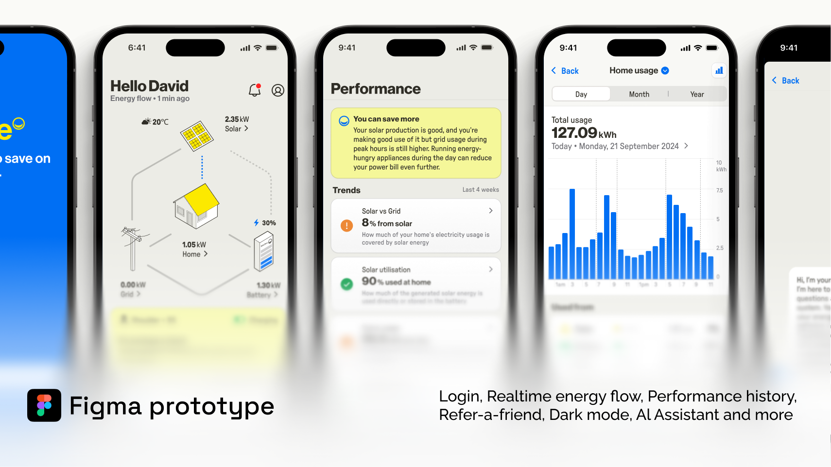
Designing a multi-platform Solar Monitoring App
My Impact
Led the design of SolarZero’s revamped multi-platform app, creating a seamless experience for iOS, Android, and Web users.
Translated complex energy data into user-friendly visuals, empowering customers to understand and act on their energy usage.
Collaborated closely with cross-functional teams to prioritize features, align with technical constraints, and deliver within tight deadlines.
Validated designs through usability testing, making key refinements to data visualizations and navigation based on user feedback.
Delivered an MVP on time, improving user satisfaction, reducing support calls, and achieving a 4.6-star rating on app stores.
Background
SolarZero, a leading solar energy company in New Zealand, needed a major app overhaul—both front-end and back-end. Their old web app was buggy, confusing, and not doing justice to the users or the business. The mission? Create a simpler, more reliable app to help users understand their energy usage, reduce their bills, and feel good about their solar investment—all in just four months. No pressure, right? Despite the tight timeline, we successfully launched the first phase (Horizon 0) from scratch on schedule.
Problem
The old app had a knack for annoying its users. It crashed often, navigation felt like a maze, and it missed the mark on what users actually cared about—saving energy and money. Users struggled to make sense of real-time and historical energy data, and the app buried critical info like cost savings. This led to misinformation, frustrated customers, high support calls, and low satisfaction ratings.
Discovery
To fix this, we dug deep:
Stakeholder Interviews: We spoke to everyone—product managers, engineers, support teams, marketing, and sales—to figure out what mattered most to both users and the business.
Heuristic Evaluation: We dissected the old app, noting what worked (like basic energy tracking) and what needed a complete do-over (hello, data visualization and navigation!).
Customer Feedback: Insights from support teams and previous research gave us a clear picture of what users valued and what was competitive in an energy app.
Whiteboarding: We sketched out ideas with engineers, product managers, and delivery leads to nail down the app’s structure and prioritize features.
Process
Prototyping
We whipped up a clickable prototype in Figma to bring the app’s new vision to life and align everyone.
Starting as a wireframe, we iterated on the design with each round of feedback, keeping technical constraints in mind.
Usability Testing
Remote usability tests and interviews helped validate the app’s design and uncover areas for improvement.
For example, we made key tweaks to data visualisations and labels based on what users found confusing.
Iterative Development
We broke the development into three phases:
Horizon 0: Core features like login, onboarding, and basic energy tracking.
Horizon 1: Better data visualizations, historical usage data, and savings.
Horizon 2: Advanced features like personalized recommendations and self-service options.
Each phase followed agile sprints, integrating user feedback along the way.
Outcome
The MVP launched on time, delivering a cleaner, user-friendly interface — on iOS, Android and Web.
Key features included simplified energy flow visuals, performance history, clear cost savings insights, and self-service features.
Customers reported feeling more confident about understanding their energy usage and savings.
Number of ‘angry calls’ reduced significantly, and engagement with new features like personalized recommendations went up.
Better engagement with the app aligned with SolarZero’s business goals.

