A tool to help kiwis use electricity sustainably — Part 2
Background
In Part 1 we explored how we created a tool to dispel myths about renewable electricity, educate Kiwis about the national grid, and empower sustainable energy decisions. While the initial release sparked conversations, user feedback revealed opportunities for improvement.
Part 2 focuses on how we refined the tool based on this feedback to drive greater engagement and meaningful behavior change.
Dogfooding and Internal feedbacks
Once we launched the initial version of Eco-Tracker, we had a group of employees including myself use it the way it was intended to use. Soon we started realising it’s shortcomings and scope for improvements.
We started collating everyone's feedback into one list.
Discovery
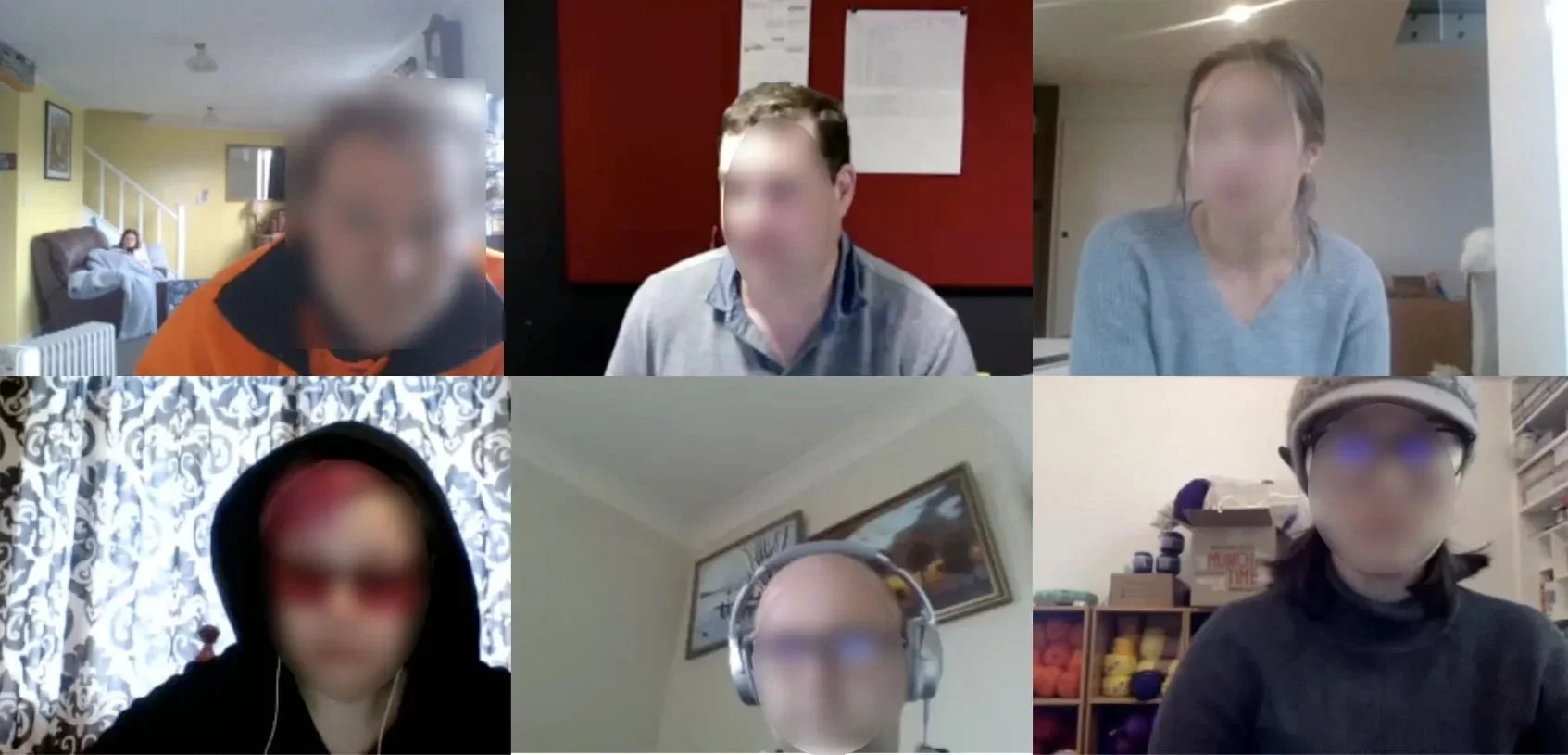
About 6 months since the launch, we invited some customers for face to face interviews. We chose both frequent users and those who haven’t seen this feature. The goal was to validate our own findings from the dogfooding and look for any other problems from the perspective of both frequent users and first-time users.
We interviewed 15 customers during the course of this project
💡 Key Findings
We collected all the problems we discovered from internal feedback and user research. Common themes were these:
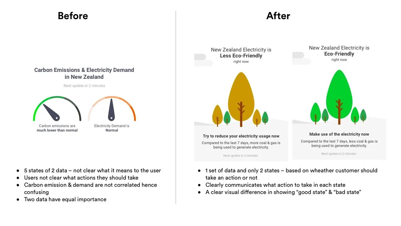
- It informs on a lot of things but is not clear on the actions to take.
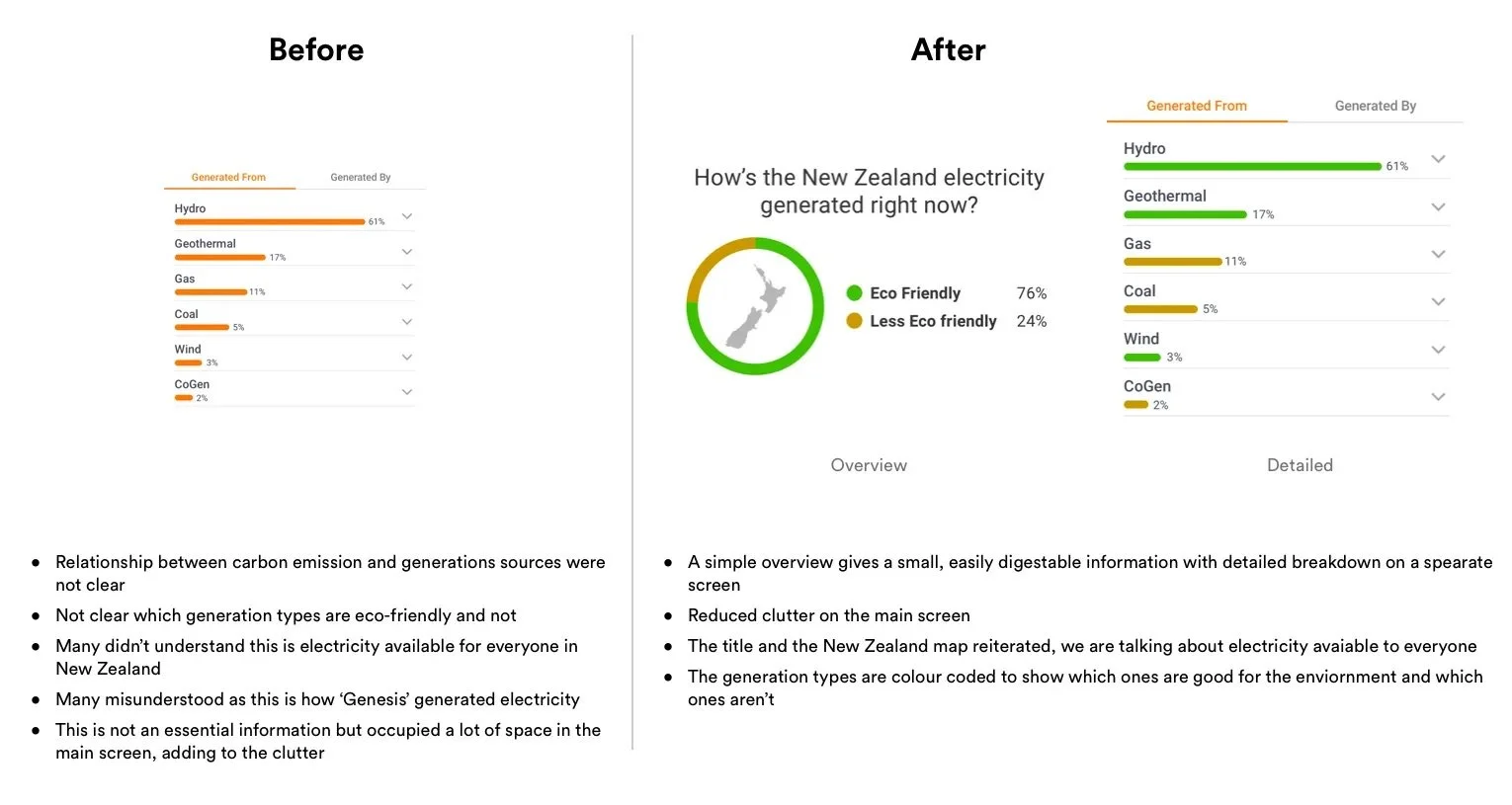
- It is packed with too much information, lacking a clear hierarchy.
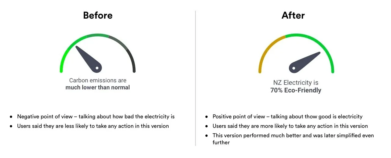
- The visualisation of information is too "nerdy" and challenging to understand.
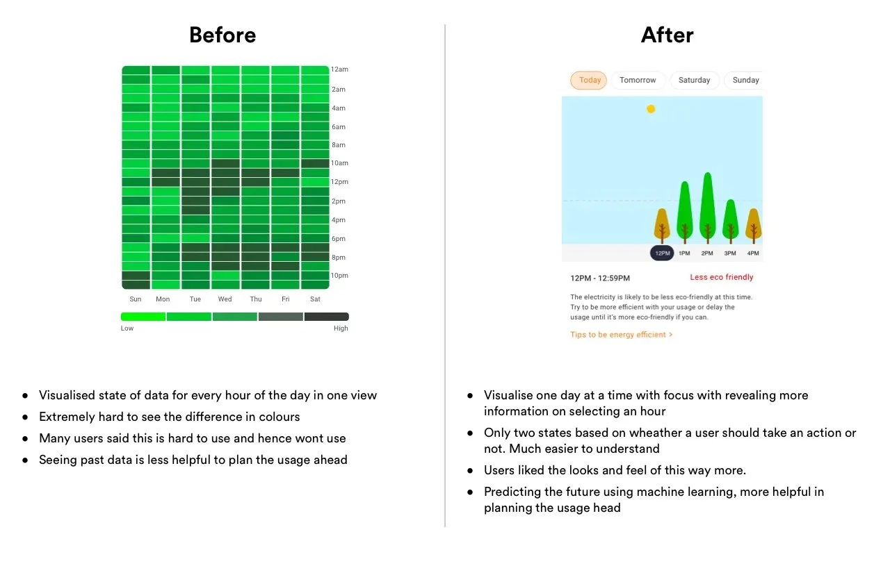
- The past trend is not very helpful in planning ahead as it is not correlated.
- There is no clear incentive or benefit in using this tool to be sustainable with energy usage.
- When users change their behaviour based on the tool's data, the effect is not clearly visible.
- The carbon emission data is not strictly related to demand, with both sets of information sometimes conflicting.
- The colours used on the scale have less contrast, making them difficult to differentiate.
- It wasn’t clear how exactly electricity contributes to carbon emissions.
- The heatmap visualisation showing past trends is too hard to read.
- Some users felt bad seeing the impact they were causing from their energy usage.
Framing problems into opportunities
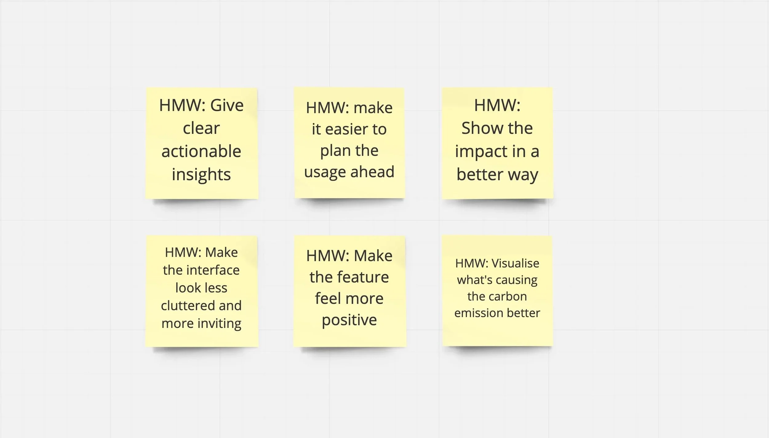
With a clear view of the problems, we started thinking about how might we solve these problems. With the help of the product owner, we narrowed down to 6 points.
Ideation
All these feedback fundamentally changed the way we think of how we design this feature. We did 3 rounds of iteration and user interviews for this redesign.
Our thinking shifted from “How do we visualise this data” to “How do we visualise for a specific user outcome.”
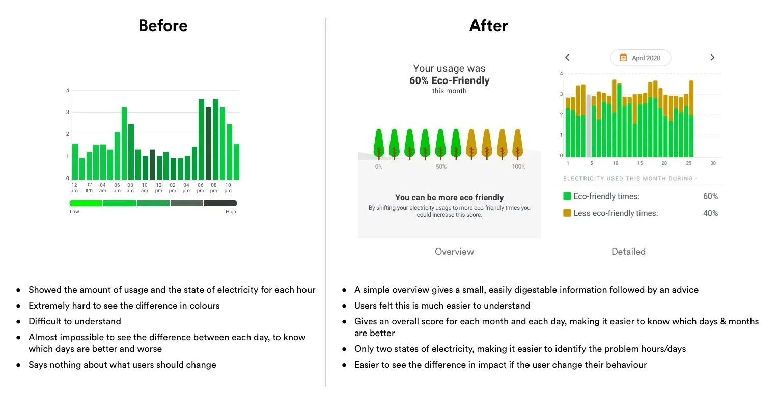
Concept testing and feedback
We tested this redesigned version with 10 users. The feedback was very positive from both frequent users and first-time users. They felt there is much better clarity in information and there is a clear indication of where to go and what to do next. So we decided to fully design and develop it.
Solutions
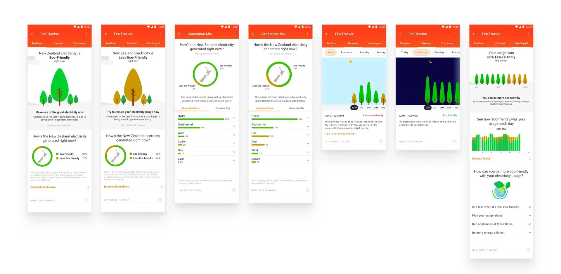
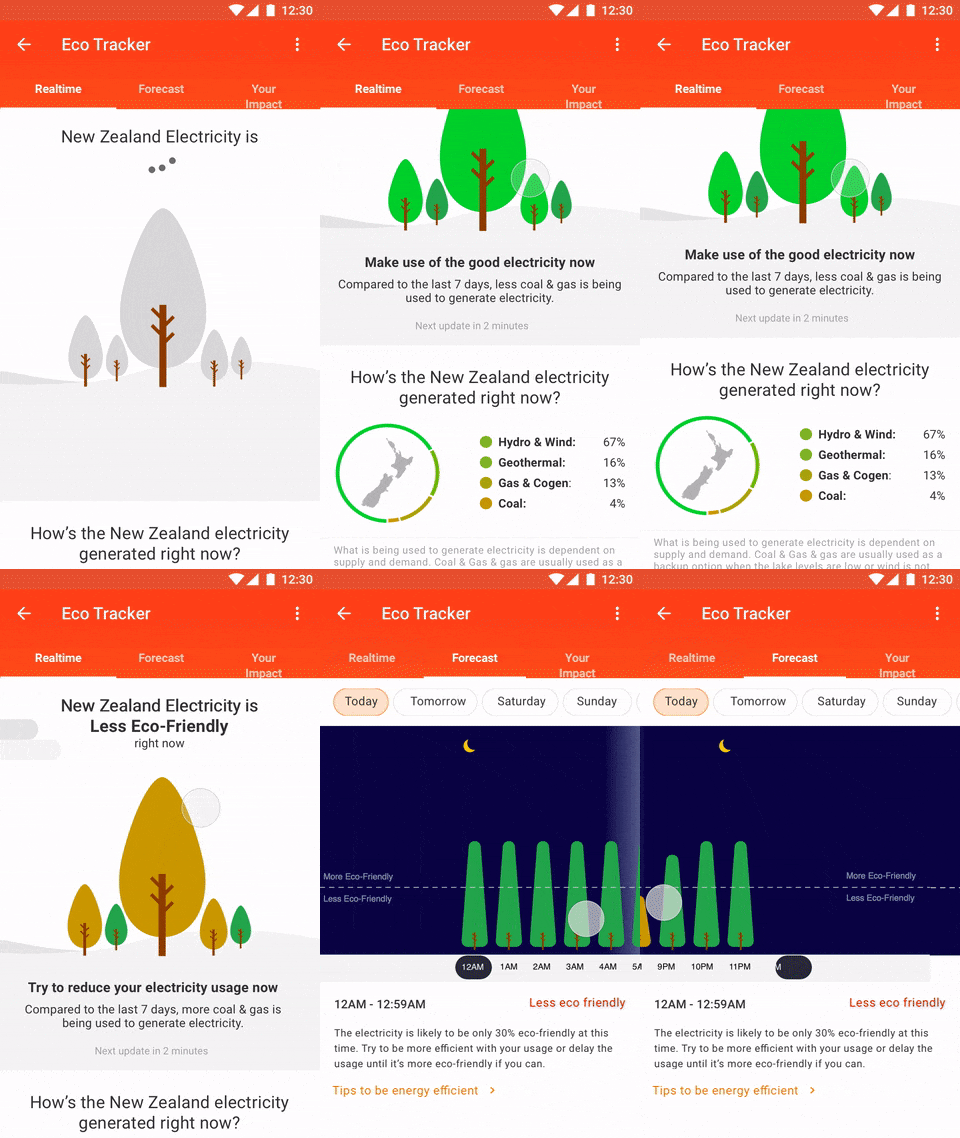
This is how the final design looked like:
Mocked this up in Principle to show the interaction to devs. The content was not final at this moment.
Outcome
At the time I write this, we have just released the web version of eco-tracker and started collecting the feedback via hotjar. Initial feedback is very much in line with what we saw during user testing sessions.
And interestingly, both the overall traffic and active users of this feature has increased, though it’s very early to say it conclusively.

